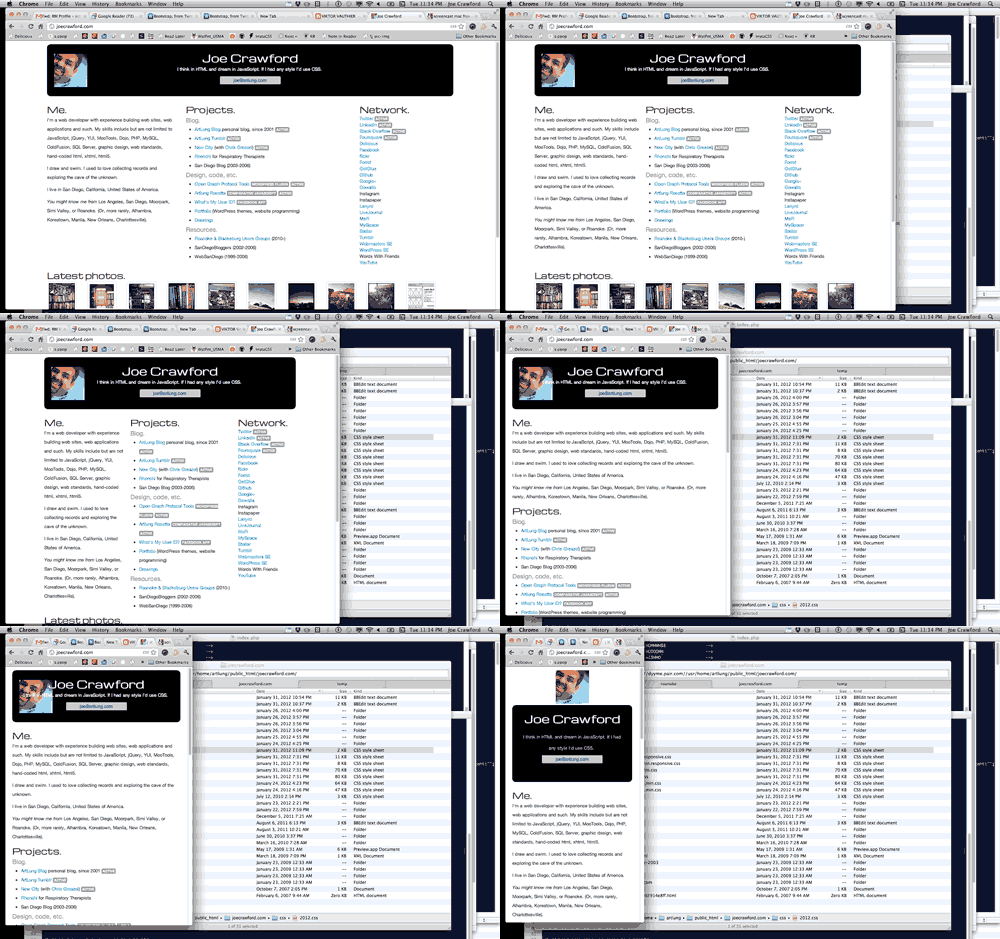
Continuing my series on upgrading joecrawford.com using Bootstrap. Bootstrap 2.0 was just released, and it has some default “responsive” features. What’s “responsive” about it? Stanford has a good definition.
Responsive web design
A website that responds to the device that accesses it and delivers the appropriate output for it uses responsive design. Rather than designing multiple sites for different-sized devices, this approach designs one site but specifies how it should appear on varied devices.
Check it out in this animated GIF, or by visiting the site in a current browser and resizing the main window.

Basically by including bootstrap.min.css and bootstrap.min.responsive.css, and adding a few @media queries in my CSS, and a meta tag like: <meta name="viewport" content="width=device-width, initial-scale=1, maximum-scale=1"> I get a responsive layout nearly for free from Bootstrap with their upgrade to version 2.0.
