


412 blog posts.
Archives the long history of artlung.com
2021
515 blog posts.


2017
284 blog posts.

2015
573 posts.

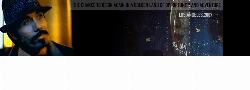
2011


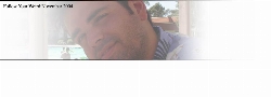
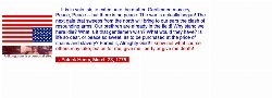
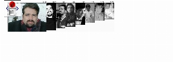
Looking at 2011's headers in reverse chronological order you can see it get less and less communicative. More stark. Darker. Reading it in chronological order and things get more hopeful and colorful.
420 blog posts.
2010

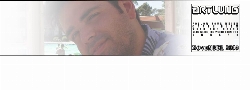
2010 was the year my Mom died, and the black header was my way of communcating grief.
In retrospect that's how I look at it, though at the time I just thought a clever or graphically complicated header looked inappropriate. It was not what I wanted to convey with my website.
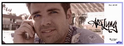
121 blog posts.

2008
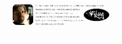
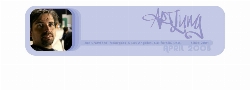

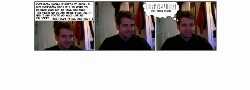
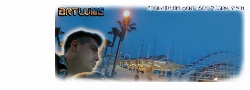
Leah took this great photo of me at the boys' football game and I rode that photo for quite a while.
At the time I was using an off-the-shelf WordPress theme and these headers all fit into that scheme.
This was before I figured out that the best way to get the look you really want out of WordPress is to build your own theme properly.
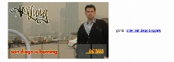
292 blog posts.
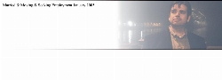
2007


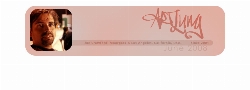
Not much changed between 2005 and 2007, but this was how the homepage and most of the site looked then. It had a random header on the home page. As life got busier, more emphasis was placed on the blog.
381 blog posts.
2006
341 blog posts.


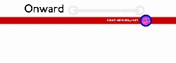
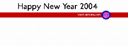
2003
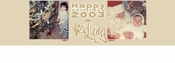


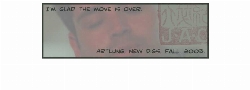


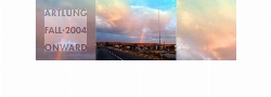
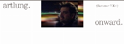
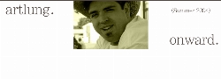
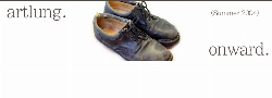
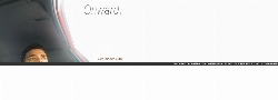
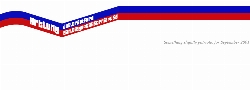
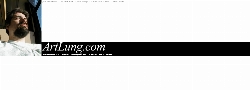
July 2003 brought many changes, including a revamped and simplified main page for artlung.com. A stark image announcing "Onward," combined with a list detailing events in my personal and professional life.
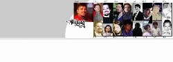
540 blog posts.
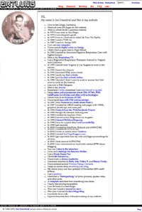
2002


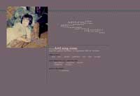


This splash page was originally in blue, and was in place starting in early Summer, 2002. It is in xhtml and uses CSS for layout. The pixelated design, coupled with the personal touch of my face gives a warm, friendly feeling. The page is filled with links, encouraging visitors to explore.
"Kitties Thinking" is one of my favorites. A DHTML effect is used to explain what the links are in a "thought balloon" above the cat's head. The cat in question is my sister's cat Ferris. The image is a charcoal drawing I did sometime in 1988 or 1989.
"Mr Spaceman" is from a watercolor illustration I was always proud of, though it appeared as the splash page only briefly.
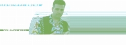
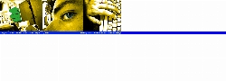
"Joe in Headphones" is an experiment in color for me, based on a photograph of me as a kid, listening to records. I might have been listening to "Philadelphia Freedom" or maybe "Theme from Batman" - but I sure look comfortable. The use of small accents here, using CSS and xhtml, is meant to give a clean, but friendly impression.
"Supercolor Joe" is kind of nice. DHTML plays a prominent role in this design, as the links are only available that way. The picture of me is rather flat though, despite the fun use of colorizing effects. As an academic exercise in CSS positioning, this was a success.
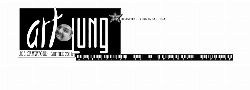
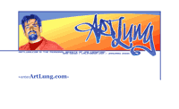
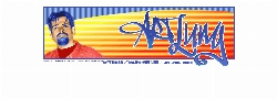
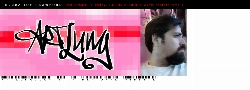
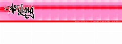
This is the first use of the "Graffiti ArtLung" logo, with a bold digitalized pink backdrop. Also used is a grunge effect on the main links, which lead the visitor directly to the blog, or open a lower section of links to the whole site. I also like the use of bar codes on this page.
666 blog posts.
2001


I started blogging this year. It was with blogger.com, the way that worked was I would write in blogger.com and would publish to a file that was transferred by FTP to my server.
324 blog posts.


1999
joecrawford was put live in 1999. The idea was for it to be my professional page, as increasingly my site was personal.
4 pages. Full Archive.
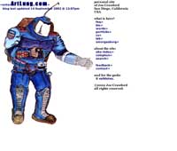
This was the initial design for joecrawford.com. Several elements and the color scheme carried over to the actual site.
1 page. Design Comp.
1998
I put in a framework that lasted through Summer of 1999. The architecture was based on server-side includes as implemented in Apache. The volume of pages here makes an SSI approach make a good deal of sense. Additionally, the framework would accommodate almost any content inserted. The goal was always to have the sites' HTML and CSS validate. This was an important value and the site rendered very consistently across browsers. The layout was designed to be "liquid," that is, it would stretch and squeeze in to accommodate almost any screen resolution. The principle of making pages work as well as possible, across as many browsers as possible was, and is, an important one to me. It was with this design that I began using the domain artlung.com.
1 demonstration page.
1997
This website got me a good deal of work. It is a portfolio and a personal space. I think it did its' job very well. This was my second public website and was hosted with earthlink.
36 pages. Full Archive.
1996
This was my first website posted to the web. It's rudimentary, but features the things that have been a hallmark of my
personal site since then: many outbound links, lots of art, and a resume.
It's a good first site, but not a good site.
3 pages. Full Archive.
This is my very first website. It was never posted to the web, but was the very beginning.
I have come a very long way since then. The parody (ripoff?) of the Art Center College logo, sized far too big, is the site's only
prominent feature. l
2 pages.