Yes, Tracy did:
I’m taking a risograph printing class soon so I need to design something for it! 😳 I’m allowed to use two colors so I’m looking for some interesting ways people have used that restraint.
I have really enjoyed working with Riso! I’ve done comics that way (though mostly I’ve reformatted 8-1/2″ by 11″ for the web using scans of the printed work) – perhaps I should take my stuff down from Gumroad or at least put the PDF up also on this website. Hmmm. The prints in the merch area were done that way (one 3-color, the other 4) — by Burn All Books. I did the artwork in Procreate and sometimes PhotoShop to make the decisions about the separations. The beach toys one was a super fun challenge to do separations for. The result is variable.
And some of the work I’ve seen in Riso is just astounding. Recently I bought some prints from Natalie Andrewson whose work is amazingly playful.
And I’m always looking for tools to help previsualize the layers for Riso output. There’s a Mac app called Spectrolite. With it one can choose a palette. BAB has a number of colors, but not all colors to play with which makes for interesting constraints. Also I was warned that the more colors one chooses, the more likely the printer is to soak the paper in ways that might dull the image. Constraints seem built into the method.
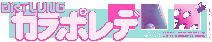
I chose a pink and a pale blue green:
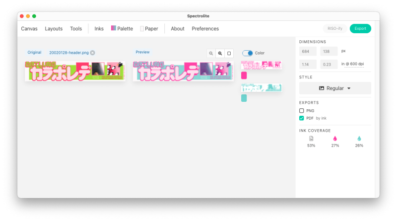
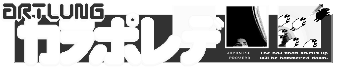
Which results in layer files in grayscale:
And the app also helpfully shows a preview of what it might look like when printed:
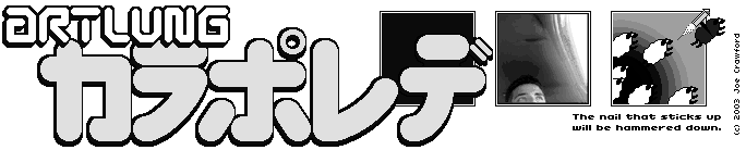
(Based on this artwork)

one comment so far...
I’m taking a risograph printing class soon so I need to design something for it! 😳 I’m allowed to use two colors so I’m looking…