I’ve been having a blast with updating all of my blog headers.
CSS Battle continues to influence my thinking about how things look.
How little code can I use to accomplish a result? Code Golf? There’s an old tv show called Name That Tune and contestants would “bid” on how many notes of a song they would need to identify a song by name. “I can name that tune in 5 notes!”
I have avoided updating these old designs because of a bad idea. The bad idea was they were permanent and immutable. They mustn’t be changed. To update them would be to misrepresent what they were. Antiques! Precious archival materials.
They’re not antiques.
They represent an intention from the time. They were my idea of the time to convey tone and mood and my life at the time. It’s not their code that is important. What is important is the idea.
They deserve to be seen and do what they were intended to do.
Or, at least, I want them to convey what I meant at the time.
People aren’t looking at them in Netscape Navigator or Microsoft Internet Explorer 6.0.
And so, the peculiar way I relied on cellspacing, cellpadding, vspace, space, and blank GIFs no longer applies. They now render in ways totally unrelated to the design intent. This is the nature of digital creation.
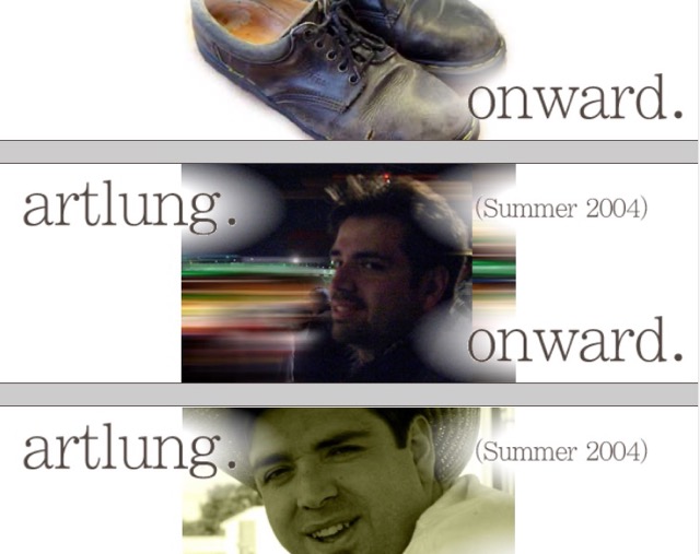
For example, here’s one from 2004 which features a pair of shoes which I wore the heck out of. Doc Martens. I was broke. And so I wore them and wore them until they failed.
Originally I had that as a table with 6 cells over, 4 rows. With the first rows using the bgcolor attribute to get a color. It was the best choice in 2004 but not where I live now, 2024.
Moreover, when I scaled the browser width narrower it became a jumbled mess. Optimizing for 640 pixels wide or 800 pixels makes no sense now. It never made much sense anyway, as the future would always bring bigger screens, but here in 2024 the “pixels” we use are sort of a weird compromise around how things work. And I can use a CSS border to represent those top and bottom bars rather than a table cell with a colspan of 3 and a weird width of 100%.
In the new version I also made decisions about how the thing would scale, changing the images of the text to be transparent, and including some elliptical gradients behind them so that they look nicer.
You can resize your browser (if you can resize your browser!) to see the result, or see a representative scaling change below:
I’ve been using CodePen for this.
Here’s another interesting one, with bold color and a more complicated design:
And to look back at differently political time:
Something slightly patriotic for September 2001.
I’ve collected these into one CodePen Collection there: ArtLung Blog Headers (2000-2024).

one comment so far...
[…] interface changes for the page which allows viewing these old headers. A few weeks ago I mentioned updating the headers themselves to use modern CSS techniques rather than old space GIFs and tables. This improves the page which allows surveying these little […]