Wait, that’s not the name of the band. I am thinking of Happy Mondays. You’re twistin’ my melon man. Likely because 24 Hour Party People is on Criterion. It’s quite a lot. It’s drama and dirt and myth making. It hits me along the axes of creativity and memory and fandom. Of the things depicted I remain a fan of all things New Order and Joy Division.
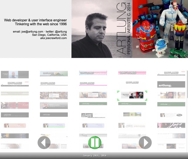
This morning I designed and created a new HTML + CSS header:
And I created a new WordPress shortcode to include it. I already have a private PHP class (including unit tests) which handles managing the headers. It allows me to get the correct headers by year, by year and month, and for whatever day I want.
I also updated the archived headers page so that it’s a bit cleaner. I was reading some old posts and I once called that the “dead headers” page.
But…
Deadheading is the practice of carrying, free of charge, a transport company’s own staff on a normal passenger trip so that they can be in the right place to begin their duties.
And of course…
A Deadhead is a fan and follower of the rock group the Grateful Dead.
I also made some user interface changes for the page which allows viewing these old headers. A few weeks ago I mentioned updating the headers themselves to use modern CSS techniques rather than old spacer GIFs and tables. The changes I made today to the layout and JavaScript improves the page. They allow you and me to survey these little graphic design nuggets I’ve made over the years.
I improved the “autoplay” mode. I added a little graphic along the circumference of the button showing the time count down.

I’m not a graphic designer. I did take classes long ago at UCLA Extension in Photoshop and the vector tools of the day (Adobe Illustrator and Macromedia Freehand), plus QuarkXPress. And working in web production on websites I’m comfortable with just about any graphics software you can think of: from MS Paint to GIFBuilder to Flash to DeBabelizer and many other archaic tools. When I got an iPad I was excited to draw with it. Initially with Brushes.app (RIP) and later with Pencil and eventually Procreate.
I’ve been paid more for my work in programming than for graphic design. And I’m paid more for programming than I could make as a respiratory therapist too. Which always seemed very strange but the culture values HTML more than running the mechanical ventilators that provide life support.
I enjoy combining my art skills with technology. My earliest experiences with the TI-99/4a compelled me to learn hexadecimal code to create graphics. And the combination of art and science and interest in filmmaking technology–what we all now refer to as CGI–compelled me to move from Virginia to Los Angeles way back when before I was ever aware of the web.
Once I discovered the web, I started using it to make graphics and I’ve not looked back, and that’s for the better. I love seeing folks use their skill at drawing. I love it no matter what the skill level. Drawing and communicating graphically is a skill all human beings ought to try. It’s incredibly useful.
I think about my grandfather. Jesus “Artie” Silva. It’s his birthday today. He was a truck driver. As a kid he purportedly sold tamales on the street. His final career was as a produce department manager. The word was that when they needed a produce department to be set right, they called upon him. I remember very well him in a green apron at the grocery store Big Bear (and later Food Basket–or was Big Bear first?). Spraying those tomatoes and cucumbers. Assuring that the potatoes and were displayed properly.
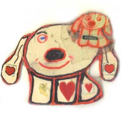
And yet, he drew. Many years ago my mother sent me this (I blogged about it at the time):

[Your grandfather] was always drawing this dog. He drew them on everything, he even made little boxes with pictures of dogs. Love you both, Mom
Everybody can draw, everybody can create.
Go make something graphical. Even if it’s a squiggle. It’s so fun.
And please do visit my headers page. Dead or not.
Happy Tuesday!

two comments...
I do miss the days of Macromedia. People seamlessly integrating these intricate Flash animations into their pages. I was never good at Flash, but damn was I obsessed with trying to be good at it 😂. MySpace layouts using Photoshop and Imageready. Damn.
The header idea is genius. If I ever make another blog, I will steal this idea, and it’ll be because of this article.
Hope you’re doing well man.
Aaron! What a blast from the past it is to hear from you. And oh my yes MySpace layouts. I have been doing this long enough to have worked on some “Takeovers” for MySpace ads. I think one of the Terminator movies. So much CSS and weird code to make them work.
Also, your comment tickled my old synapses enough to remember I once drew you during some work meeting. 10 years ago!
Today’s Meeting Doodle — also on Instagram.
I am doing well. And I hope you are too.