In the 1990s I would buy the magazine “Serif” (a site with a lot of broken links) at World Book & News on Cahuenga Blvd in Hollywood. I enjoyed it. When I bought my first Mac at the UCLA student bookstore I bought a copy of Fontographer. I never made much of a font with it. It’s very hard work to make fonts. I loved making letterforms as a kid. I loved graph paper. When I was a teenager my grandmother tasked me to do calligraphy. When a friend of hers died I would do calligraphy on the prayer cards she would send to their family. I loved playing with pens and letters and numbers. I loved pushing the bounds of what would read as a letter. At the IndieWeb Camp San Diego 2023 in December they had a magnetic board with letters on it and I spelled out the camp name. It didn’t have enough letters so I used other magnetic kid toys to make it work. I didn’t take a photo. Oops. It was fun. (Edit: gRegor got some photos). It was fun to get feedback from the other campers on what worked and what didn’t. Playful. There’s probably a lot of posts that include typography in this site. I’ll share just two: experimental letterforms (in English and Japanese) on my Amiga back from the 1980s; a handwritten font I made using a website called Calligraphr.
Nick Simson is a talented designer I encountered on an IndieWeb Zoom call a few months ago. This month he’s doing what he is calling 26 Days of Type:
Each day I’m going to explore a different typeface or topic related to typography.
He’s 8 days in and I’ve enjoyed it so far. I
Yesterday he posted G is for Geometric.
I kept thinking “Sesame Street.”
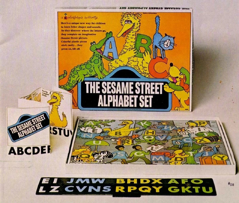
I think I had those letters as a toy set of magnetic letters from Sesame Street. I can’t seem to find the set I had online. You will not be surprised to know that search engine results for “Sesame Street alphabet” are numerous. I did not find the specific toy. I don’t think. I did find this Colorforms set. I think I remember magnetic letters a few inches high that one could put on a refrigerator. But they were elegant. Thinner strokes than in the toy below.
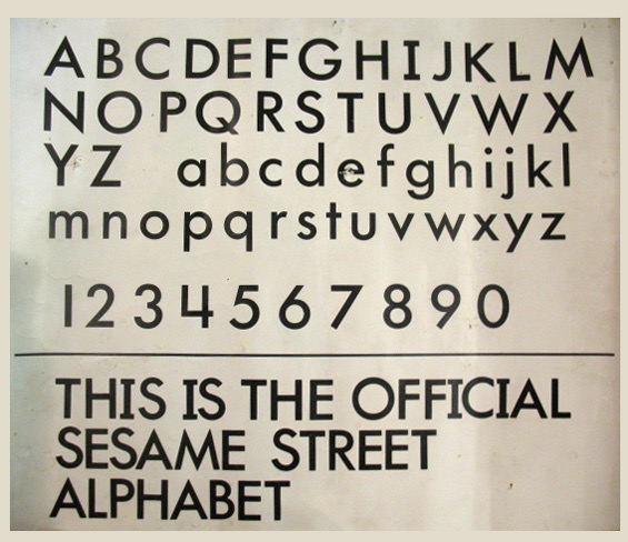
It’s much more like the letters in what seems to be a typography bible from the show. I found this online but now somehow can’t now reverse image search for it.
Memory is weird.
Holding those letters almost certainly had an effect on my brain. Relating the shapes to drawing. I feel lucky to have been exposed to interesting type young.
Check out Nick’s 26 Days of Type on his website.

two comments so far...
I appreciate the shout out from Joe’s blog today! And I’d like to contribute toward the mystery of this Sesame Street alphabet…
[…] his post The Street of Disappointment. I remember well visiting World Book & News (now defunct, mentioned in February) on Cahuenga right off Hollywood in the 1980s and when I worked on Sunset Blvd in the early 2000s I […]