oldweb dot today allows a person to use the web (rather slowly, which is how it usually worked) as it was from the past using old browsers on old websites archived by the incredible Internet Archive, which some folks call “The Wayback Machine.”
But where does it get that name?
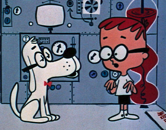
The Wayback Machine or WABAC Machine is a fictional time machine from the segment “Peabody’s Improbable History”, a recurring feature of the 1960s cartoon series The Rocky and Bullwinkle Show. The Wayback Machine is a plot device used to transport the characters Mr. Peabody and Sherman back in time to visit important events in human history.
And so, how well does https://oldweb.today work? It works pretty well! Here’s the front of my website from January 1, 2001, browsing with Netscape Navigator 4 on Windows.
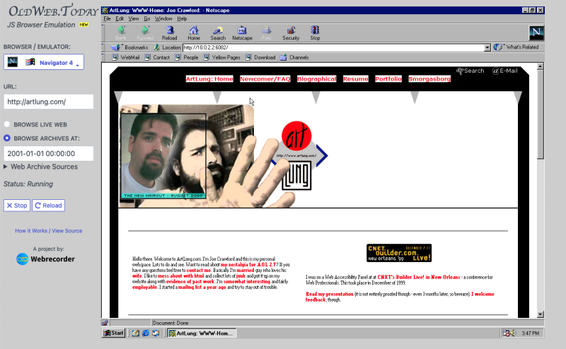
It’s a bit on the slow side. That makes sense though, things were often slow on dial-up. But Netscape Navigator boots up fine. I’ve still got the pictured header, made in September 2000:
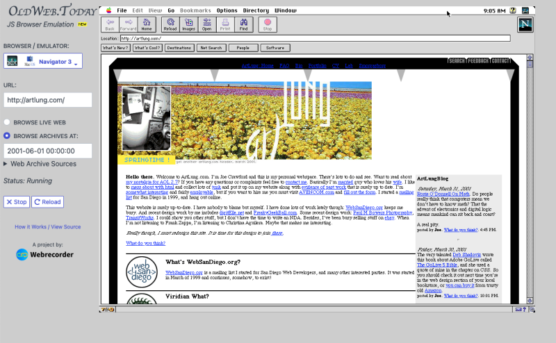
I started blogging in February 2001. Fast-forward to June of 2001. Here’s the site using a Mac and Netscape 3. I can see the blog in the sidebar. There’s “Rosie O’Donnell on Math” originally posted via blogger. I published via FTP from blogger, and then used PHP to include the current blog on the main page. I didn’t have comments, but I did include a small call to action “What do you think?” which linked to the feedback page to solicit comments.
And I really still like this header, made from a webcam photo and photos I took digitally at The Flower Fields in Carlsbad. The first time I’d been there.
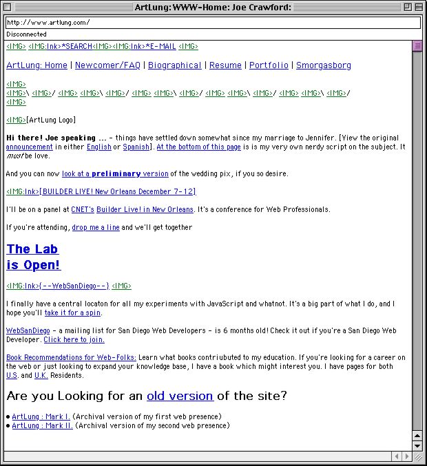
That design was very much a product of its time. Creating Killer Websites was inspirational to me, though much of what was profound in that was also horrendous from a markup standpoint. But there was no CSS to speak of! I had been exposed, on mailing lists, the ideas around accessibility and so I made an effort to have proper ALT and TITLE attributes on images when I used them. Though I’m pretty sure for those triangles at the top I used slash and backslash to represent them. Not terrible, but not really helpful to a visually impaired person.
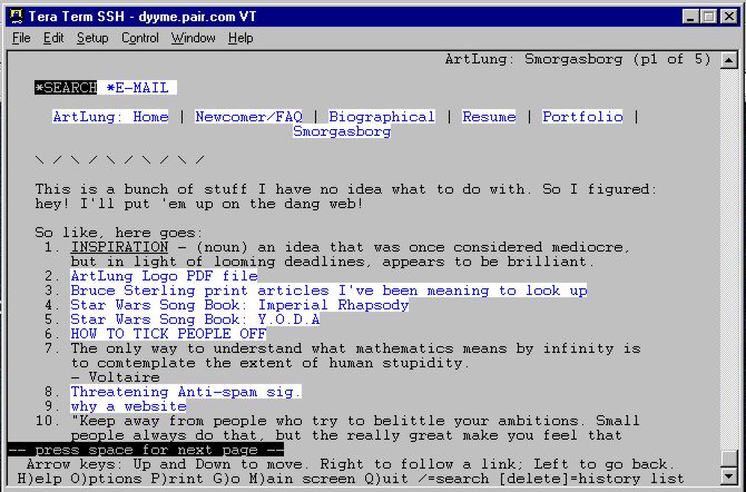
Here’s are images of different parts of the site from that era in non-mainstream text browsers:
I’ve always tried to create readable and maintainable markup but also create visually appealing work. I’m not a designer but have worked with so many terrific designers. It can be a real joy to implement great design. Here on my own site I get to create my own space in my own style. That’s something I don’t see changing. When I think about what “IndieWeb” is and isn’t, my own space on my own terms is definitely my style.
And efforts to preserve the legacy of the web like The Internet Archive are so vital, they enable us to go back in time in ways that are extraordinary.
