Brett Jackson is a designer who’s been working the web since 1997. He left his cushy gig as Art Director for Google in New York to move to Switzerland with his wife. He has recently relocated again to Los Angeles where he freelances Flash and graphic design.
In April 2010, Brett began working on a web comic called Massive Sqwertz – a comedy about a giant Smurf.
(There are two important things to keep in mind about the following interview: the both the questions and the answers have been creatively and collaboratively edited. Sorry, that was only one thing. Oh, now I remember, this will definitely get silly and snarky).
Isn’t it about time you gave up the ghost?
This interview is over. I didn’t come here to be insulted. (Rustling) –How do I get this microphone off? Can somebody– I need– Is there a sound guy? (Rustling)
That’s right, walk away. Just like you’ve walked away from everything. (Yelling) Just like you’ll walk away from Massive Sqwertz!
Hold it right there, mister! I understand that it takes time to build an audience but I can’t wait around forever. If audiences aren’t biting then maybe my time would be better used taking a shot at something else. That’s just sensible resource allocation!
If you don’t have a respectable audience by strip 50 then, your feeling is, you never will. So how do you measure audience in a situation like this?
To feel like I’m succeeding, I need a growing readership. If my readership is low and nobody is evangelizing the strip then I regard that as a symptom of low quality in the strip that I’m not sophisticated enough to detect.
They say that high-achievers tend to focus on their failings and not their successes, so I’ll try to hear what you’re saying there. It’s possible you’re being unnecessarily harsh on yourself!
Sure – absolutely. But site metrics don’t lie – failing to meet a goal means that there’s likely something wrong. If I’m making an ass of myself because of an imperfect understanding of the medium, I’d like a chance to correct that.
So that argues for putting in more work on the project, sporto?
Or maybe the next new project.
I feel like you’ve created a very worthy set of strips. As of this interview, you’ve done 48 full-color, 4-panel strips. You’ve done this over the course of 9 months. You’ve put in a helluva a job of work here Brett. Why not continue–Massive Sqwertz–and let the audience find you on their own time?
Why jump into yet another project with an imperfect understanding of that medium?
You’ve got brass, Joe Crawford. I’ll give you that, you briny so-and-so.
Watch the language pal, I’ll come straight through this Google Doc and we’ll donnybrook! Wait is that a verb?
It’s verb enough for this interview. But donnybrook me and find yourself in a brannigan.
Okay, okay, let’s take it down a notch, pardner.
Something unique in your strip is that it really cares about drawing. So many webcomics get away with stick-figures or even clip art. They’re not all terrible, but many, many are. What are the pros and cons of actually drawing your comic as opposed to shortcuts?
It takes FOREVER. However crude my comic may look to my professional friends, they should know it also takes a very long time. I like to say it takes me 3 hours to make a strip, but in reality it can be as much as 5. That’s starting the clock after it’s written.
And I use tons of shortcuts – I reuse a lot of artwork and only redraw when absolutely necessary – faces are about the only thing I always draw fresh.
I know there are better artists, I’m just trying to service the story and maybe look a little better than the next guy.
If that was your expectation, I think you nailed it, some would say you exceeded it. Let’s rewind a bit — when did you first decide to do a webcomic?
Well… the year a friend showed me how to “view source” on a web page – 1997. I realized anyone could make a webpage and the rest followed naturally. I have made previous attempts at web comics that were not this “successful.”
I like the air quotes around “successful”– it’s a rare person who can damn himself with faint praise.
Thanks, Joe. I sure hope self-deprecating negativity is a turn on.
Did you read newspaper strips or comics? I imagine you’d have been a fan of folks like Lynda Barry and Matt Groening back when both were just in alternative weeklies. If not, what comics were the ones you looked forward to, and why?
I read the comics section of the newspaper growing up – preferring Calvin & Hobbes, Bloom County and The Far Side. This was before Foxtrot and Bizarro which I love now. I bought and had confiscated 3 copies of Groening’s “School is Hell.”
What was the first drawing you ever put on the web?
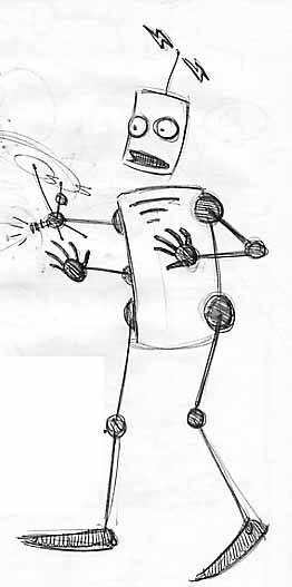
I believe that was “Zappy.” A robot mascot for my first website. Here he is.
He’s awesome!
Thanks, I’ve been drawing Zappy in various forms as long as I’ve been drawing. He also starred in an earlier Brett Jackson webcomic about a man who lived with a bunch of robots.
What’s the difference between something you draw on a tablet virtually
and something you draw on a physical surface like paper?
The paper provides a nicer grip on the nib of the pen and can fit in my back pocket.
The tablet is superior in every other regard – especially the hardware button that provides one-click “undo.”
Were you encouraged to draw as a kid?
People bought me crayons. My grandma let me have her typing paper.
You’ve encouraged people to do webcomics in your own way. You wrote “The NOT .99 Method: How to sell your book or comic for the iPad & iPhone without Apple’s help” a while ago and Warren Ellis recently linked to it. What prompted the writing, and the linking?
The writing: my own frustrations with mobile publishing triggered a neat idea. I thought that idea could be helpful to other creators, so I wrote it up.
The linking: I believe Warren Ellis discovered the Not .99 method from a forum post by friend and badassss comics creator Dan Goldman.
Folks should definitely take the time to read it.
Okay, let’s dive into tools. What tools do you use in making your webcomic?
Flash and a Wacom Tablet. See, now that was the kind of question I expected from this interview.
Do you find it a bit strange to use an interactive and multimedia tool to create static images?
To a man with a hammer, every problem looks like a nail. Flash is my hammer. I’m fastest in Flash and there’s no more versatile tool, IMHO. I’ve used Flash to make fonts, posters, applications and screensavers (as well as sites, games, and banners).
Would you mind going into more detail on how you use Flash?
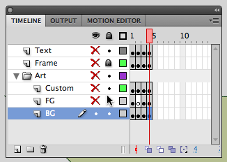
I start with a stage size that’s 768 x 512, twice as big as the final output size, and break the design into five discrete layers in the timeline…
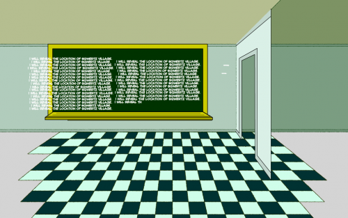
Here’s the background layer. I like to reuse environments whenever I can so I generally draw them too big and then scoot the drawing around to highlight different parts of it.
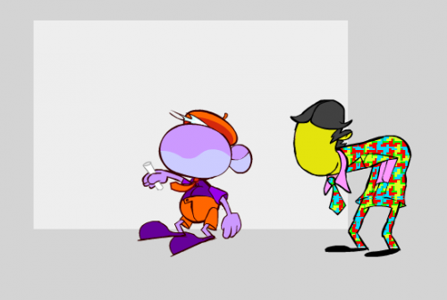
Next up is the foreground layer where I drop what is effectively clip art (that I’ve drawn) on to the stage and arrange the parts like a paper doll. Gargledoo is generally only one piece of art whether he’s in his wizard’s robe or hideous principal’s suit. Tiny is made up of the ten (or more) individual parts of his body.
Next is the custom layer where I generally draw faces, arms and hands. I draw those custom in each comic because facial expressions carry so much of the emotional weight. I’d cheat on that too if I thought it would still look good.
Those disconnected tails you see belong to the word bubbles up on the “text layer.”
I use a dynamic glow effect around my text bubbles instead of standard comic word balloons (after much internal debate) because I think they’re demonstrably better. Fundamentally they don’t need to be drawn, they automatically adjust to the contours of the text and they take up less room in the panel.
They’re non-standard and so I’m a little worried about taking the audience out of the experience, but I believe in them so I’d rather normalize them with use than avoid them out of fear.
What version of Flash do you use?
I use the newest version – though everything I need to do Sqwertz has been in since Flash 8.
How would you change your workflow if you were going to animate the comic?
Very little. I’d make the comic as-is, I’d select everything on the stage and then I’d click “distribute to layers.” Once the individual artifacts are on their own layers you simply add keyframes and tweak their positions. Go Flash.
Despite reasonably high production values, a very nice website, audiences have failed to respond to Massive Sqwertz – where do you go from nowhere?
I don’t… I don’t know. What… do you think I should I do?
Okay, let’s assume this WILL be the end of Massive Sqwertz. What are the lessons you’ve learned?
The only answer I can give is sort-of self-collapsing: don’t do it for “results.” Do it only if you can do it indefinitely without expectation of reward. We’re entitled not to the fruit of our labors, only our labors.
So, if that’s my answer, how can I end it?
I don’t know either. But I love the work you’ve put in and would love to see it progress for my own personal reasons: so I can read it!
Thanks, Joe! That really means a lot. I’m very susceptible to praise.
Brett, you’ve been very generous with your time, thanks and if I had a live audience I’d be asking them to applaud!

one comment...
[…] those interested in The Making of Massive Sqwertz, friend of the Sqwertz and site-developer Joe Crawford has posted an interview with me on his blog […]