Benji has an article on Fun with Image Maps and SVGs that’s a bit technical but also really fun. At one time I could rattle off the code for an image map pretty easily. And a few months ago I put up a page in the lab about server-side image maps (best left in 1997). Lately I’ve been writing more code that’s spacial in nature–CSS gradients and backgrounds are 2-D canvases where we place items in position using numbers. He discovered the fact that image maps scale based on pixel width, and so they don’t quite work right when we have the capability to set images to scale based on device and screen width. His solution is novel and involves SVGs, which is terrific.
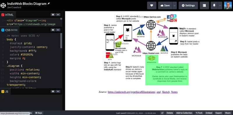
In talking about it today on the IndieWeb Homebrew Website Club I decided to play with another approach, using percentage based absolutely positioned elements. I’m not totally happy with the result. It feels brittle. And if the image changes to be a different aspect ratio or the styling on the page changes the container it’s possible what works now won’t work in the future.
Benji’s SVG approach feels a bit more robust. Something about having the code for the map refer to the image, all in the same markup, and without relying on CSS, makes me think that as long as you have that pair the code will work when the thing you made gets moved, copied, and repurposed.
Fun stuff!

