I spent this past weekend doing website maintenance. I moved some older portfolio work into my Archive. It’s where older static versions of the site go. Of course a lot of the links on that page are to the Internet Archive itself, which has lots of my old work saved for history.
This work is partly in the spirit of modernizing my old headers, which I did last winter. This weekend it was old portfolio pieces. I didn’t do anything too drastic. If there are grammar errors those are probably still there. But I wanted them to show up more like how I intended them. I replaced old bad PHP and HTML TABLEs with more modern markup and CSS techniques.
In May I wrote The Web is Better in IndieNews. It’s amazing how much more and better techniques are available to us today. I think of this work as a collaboration with younger me–he was stuck with Netscape 4 and dealing with Internet Explorer.
1999: “Interactive” work
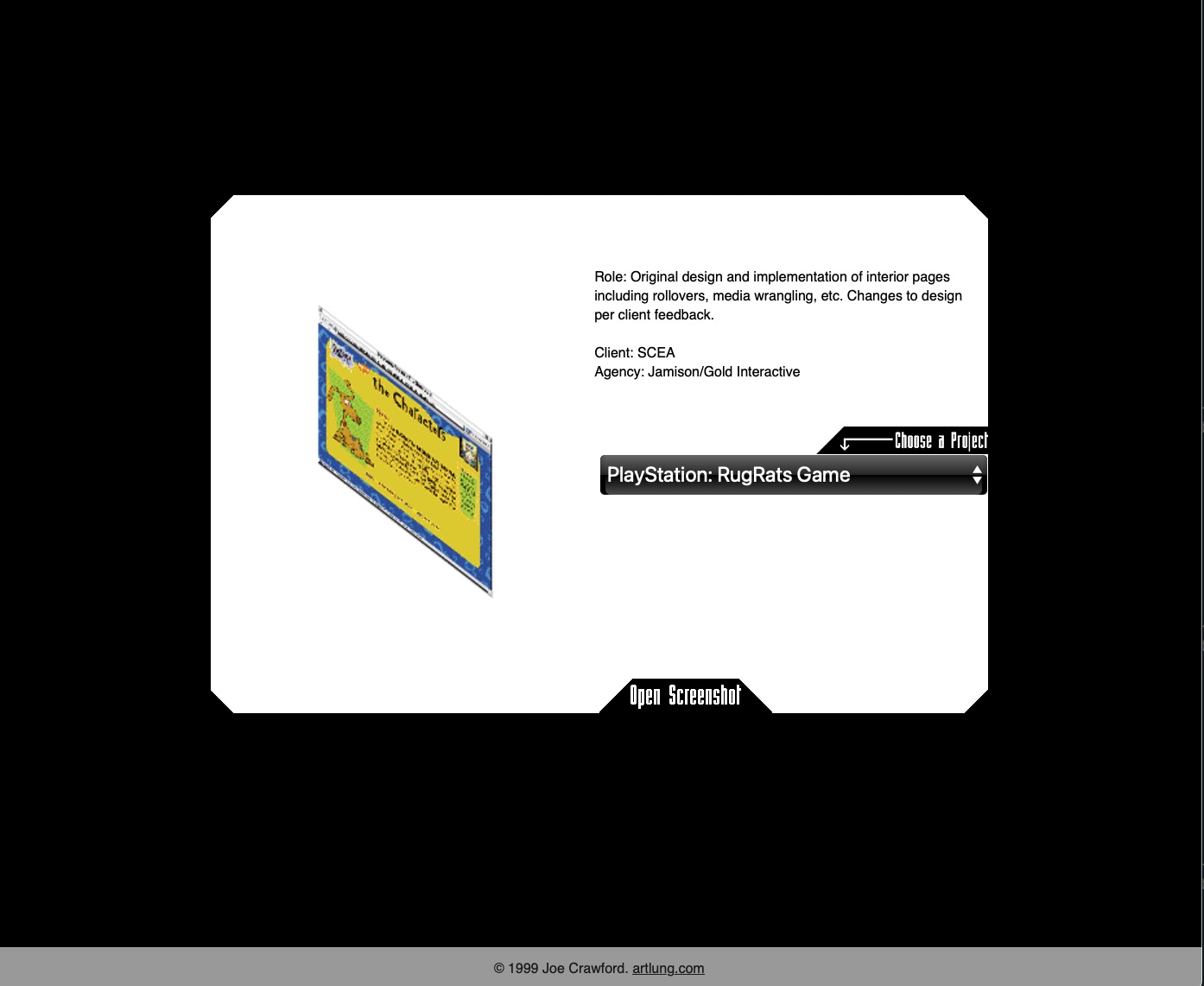
2000: DHTML
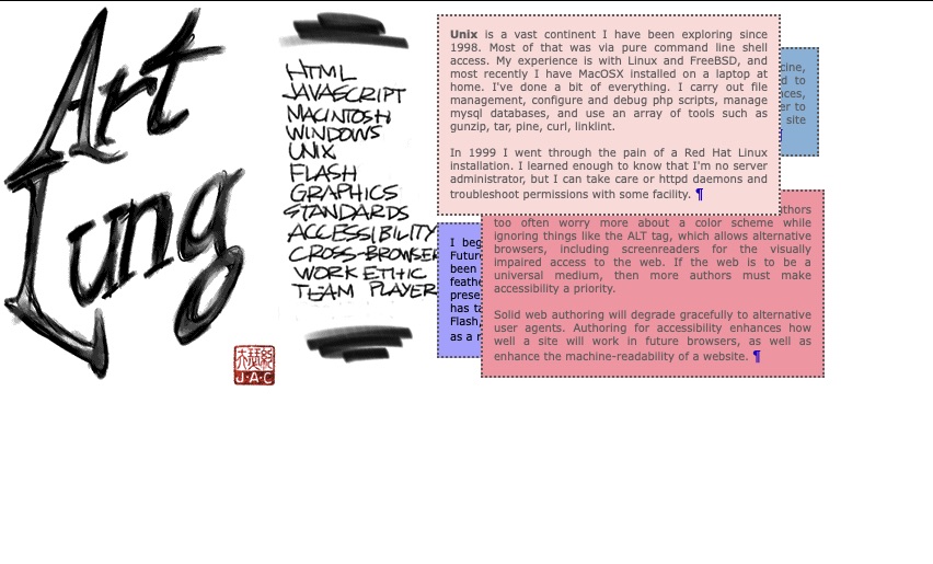
The code I wrote back then looks like the code in this gist. The code which accomplishes a simple show and hide and placement to a location must be done 3 different ways to 3 different kinds of Document Object Models using JavaScript. At the time Internet Explorer probably called it JScript. When I saved this gist my comment was “I do not miss this.” And I still don’t.
2010: jQuery
2024: No JavaScript Required
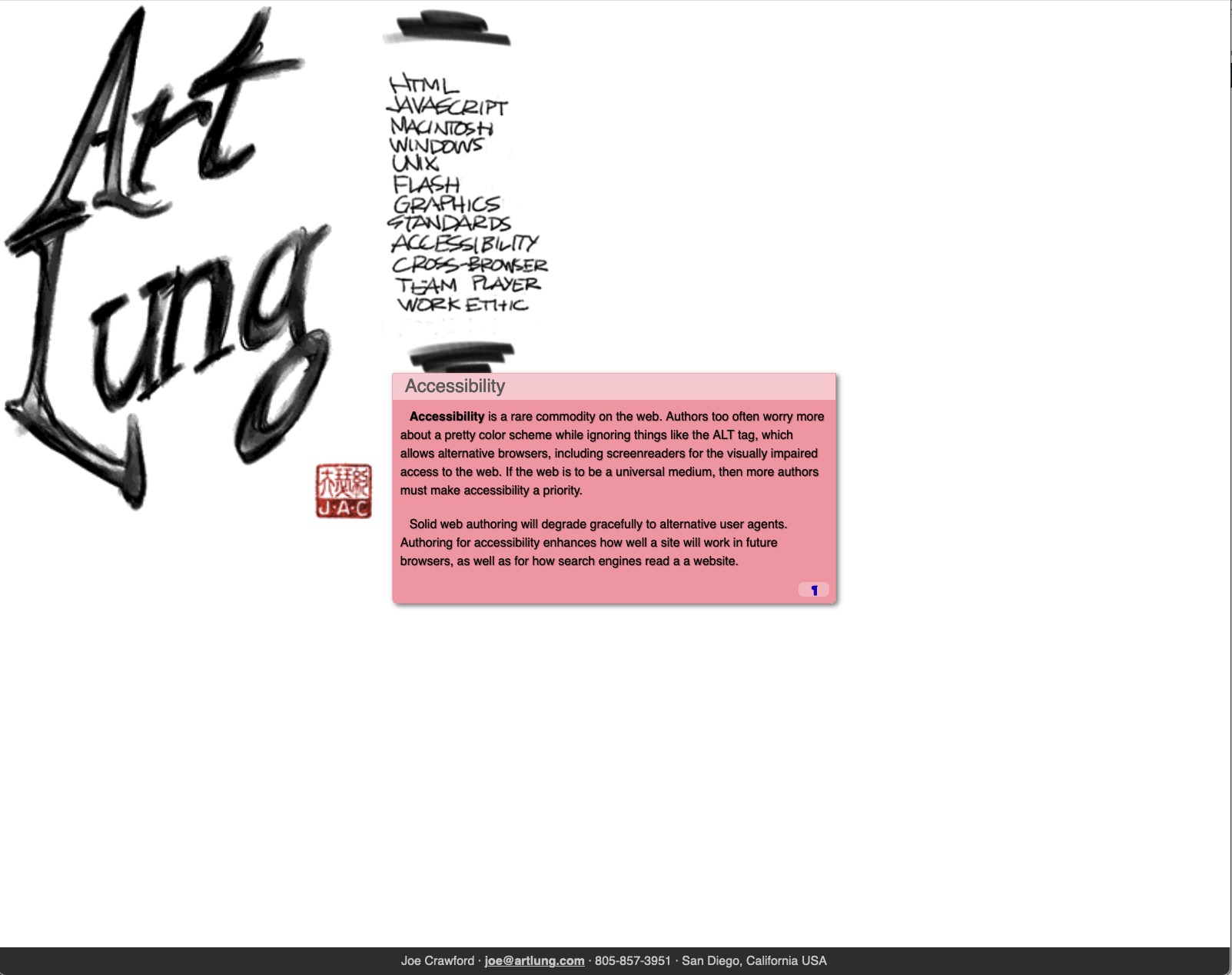
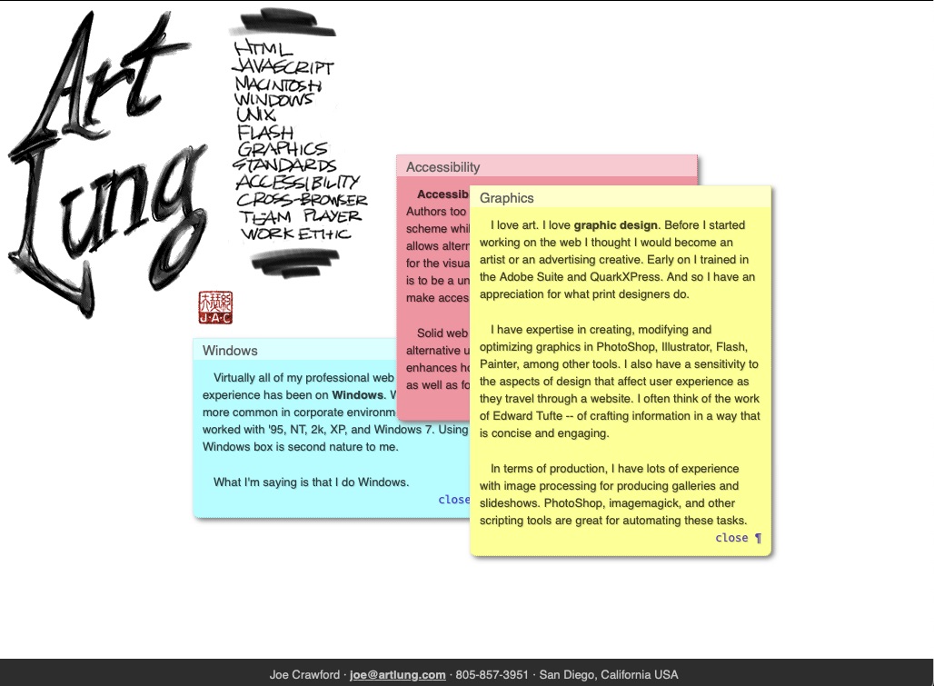
Here in 2024 I don’t have to use JavaScript at all to do what was once a very fancy demo. The Popover API makes it straightforward to create the sort of popups that required spaghetti or JavaScript libraries.
I also used CSS to make those graphics I made 2 decades ago a bit bigger on bigger screens, and adapt somewhat to smaller screens. The process was mostly of removal and simplification. In Code Golf the idea is to do the most you can with the least code. I enjoy doing the daily CSS Battle Challenge. Most days I post the video of me stumbling through to a solution on YouTube.
The web platform is phenomenal and I’m happy to get to work on it.
Under the hood: Webmentions
I also added the ability to get responses to these pages via webmention. I suppose 20 years ago I could’ve added the ability to capture pingbacks to these portfolio oddities. But I didn’t. I relied on folks to reply via email. Or even phone call. I sat in a number of interviews talking about the works above. Sometimes I got the job, sometimes not. It’s fun to revisit these older works and if they also can teach a bit of web history that’s to the good.
This week there’ll be another edition of Front End Study Hall–a regular IndieWeb meeting where we try to learn and improve at HTML and CSS–like a study group at school. All levels are welcome.
Postscript: Drawing in HTML
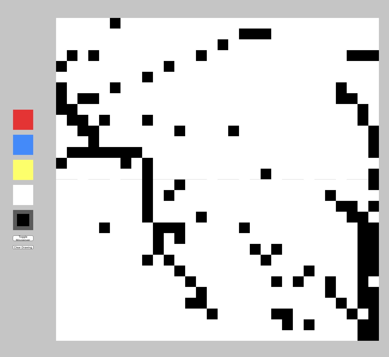
I also found a forgotten toy for drawing that I think will stay perpetually half-finished. Started it in 1999. Still working on it today. Try it. The code is simple enough that if you save the HTML, CSS, and JavaScript (and a few GIFs) you could adapt it for yourself. That’s what the web is all about.
