The New Year is a good time to do a brain dump and clean up. Put away decorations. Clean things up. Empty the various stacks in my brain.
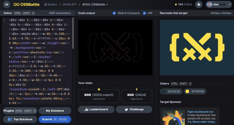
I mentioned yesterday how much I love CSS Battle. Some of the targets are really tricky. Their logo has befuddled me for quite a while and I just threw up my hands. This morning I returned to it and managed to get 100%, which, once I get to a 100% my mind is far more settled.
I made a new header today. That was fun. Heavy use of CSS gradients.
In the midst of a great conversation about LLMs I mentioned to my friend Al that Macs have a built in text summarizer, and have for years.
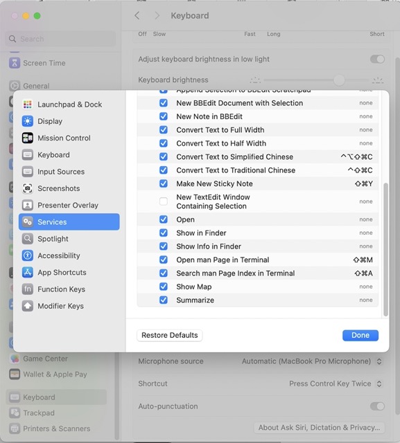
It’s still there, but hidden by default. It’s in the “Services” context menu.
To get it you have to open System Settings and go 5 levels deep in the menus at the very bottom.
System Settings → Keyboard → Keyboard Shortcuts... → Services → Text --> Summarize
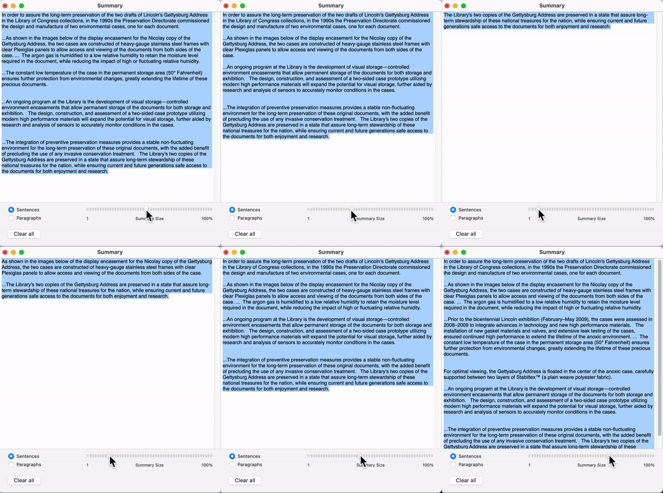
Then in the Services menu in any app you can get at the Summarizer dialogue:
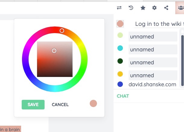
How does etherpad choose the editor color?
You can click the color when you’re logged in and set the color!
After I made my header I wanted to make a thumbnail for it, and for many years I used webkit2png to create those. Initially I used a command like:
python ~/bin/webkit2png -C --clipheight=400 --clipwidth=1000 https://artlung.com/headers/{$filename}
Where filename is the path of the header. That stopped working at some point because the tool was dependent on interacting with lower level MacOS APIs that broke. The last command that worked looked like:
/usr/local/Cellar/webkit2png/0.7/bin/webkit2png --ignore-ssl-check -C --clipheight=75 --clipwidth=200 https://artlung.com/headers/{$filename}
I tested a new tool related to wkhtmltopdf is called wkhtmltoimage which I can call using
wkhtmltoimage https://artlung.com/headers/header-20240103.php wkhtmltoimageoutoput.jpg
I tried this on my new header and the result, while functional at least, lacks the CSS background.

I don’t know if this is by design that it drops backgrounds but playing with the settings did not help.
I recently re-read about /now pages, well-documented in the indieweb wiki: Now pages, described on now now now dot com. Look for that, I think, in the future.
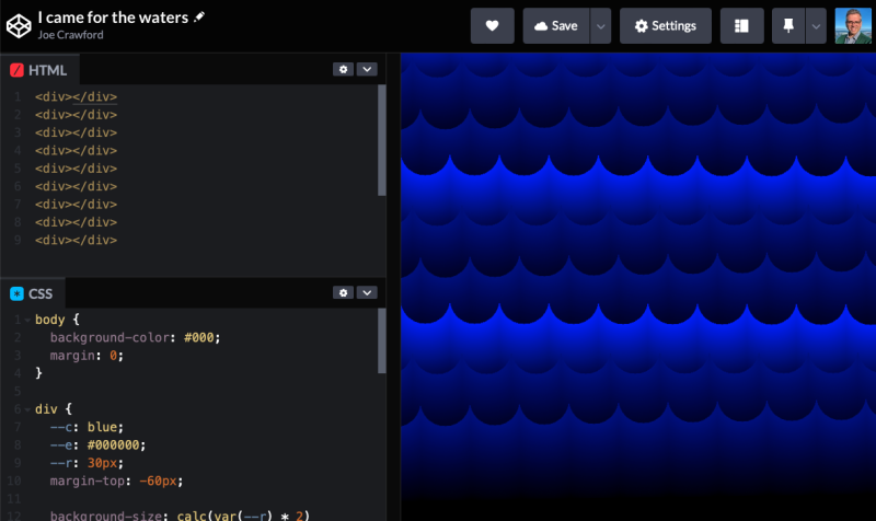
Last week I had a notion to make some CSS animated “waves” – inspired possibly by It’s A Small World and similar presentations. It’s really fun to be able to use the various kinds of CSS gradient to turn a rough idea into something that approaches what I imagined.
gRegor shared a post of his from 2013 that I found charming: Don’t Multitask With Fire, which I really like.
Thanks Indieweb Pacific Homebrew Website Club for helping inspire this post!

one comment...
[…] 1, 2, 3, […]